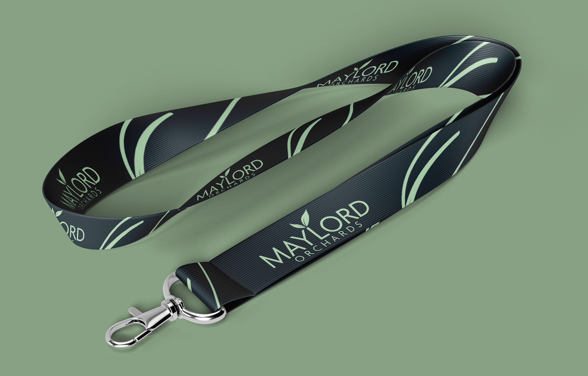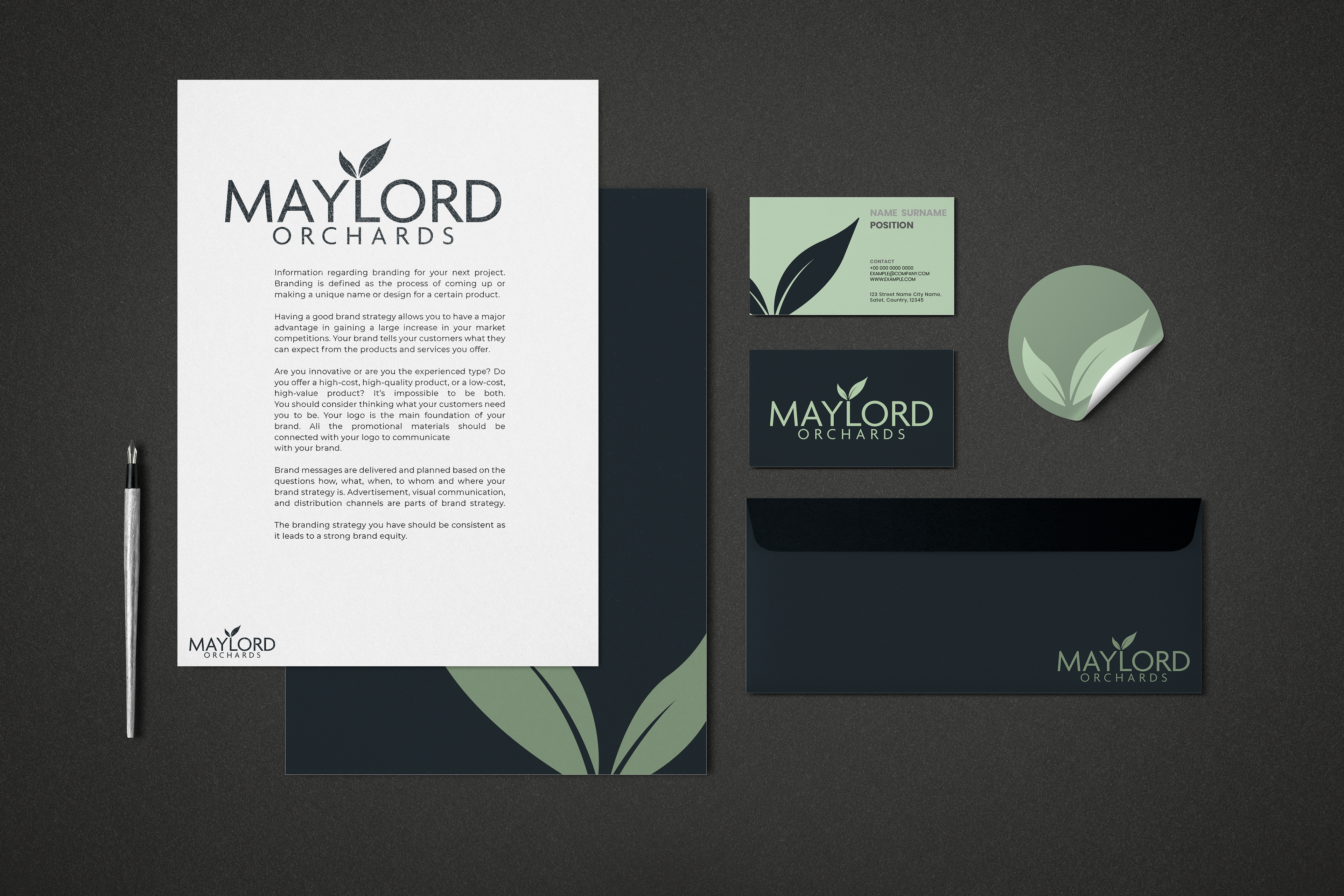
Accomplished:
logo
Pattern
colour palette
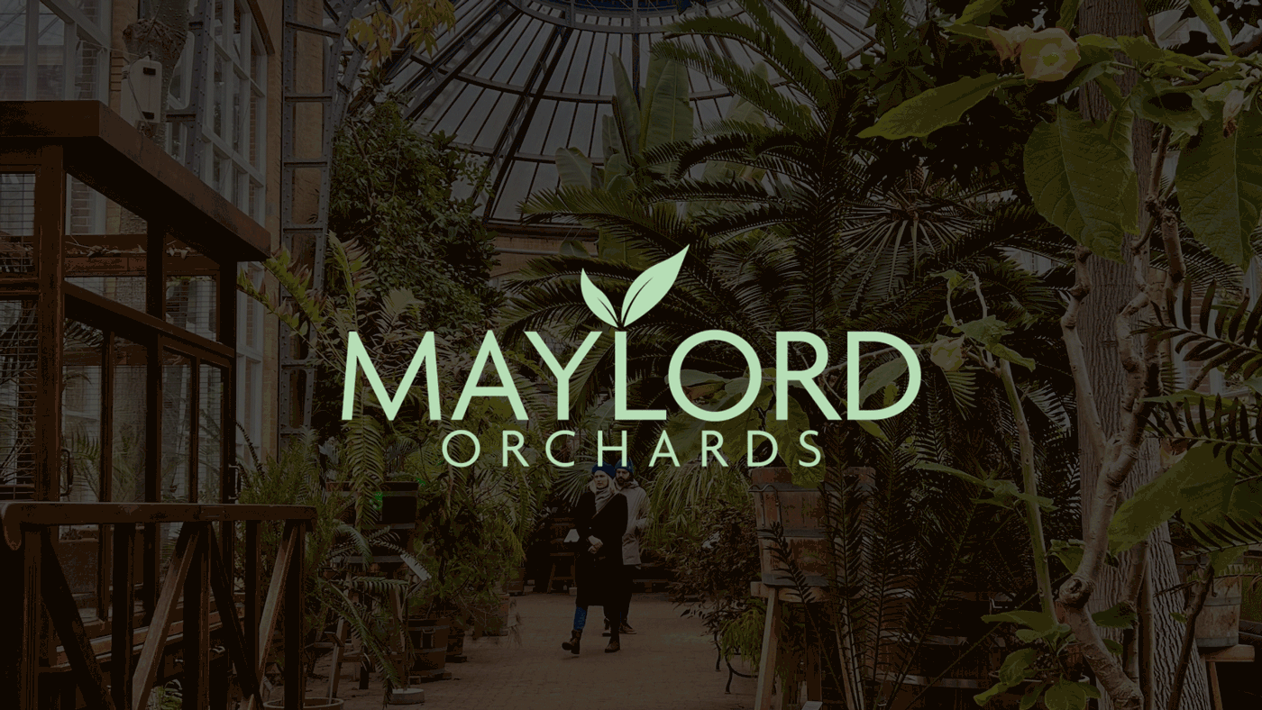
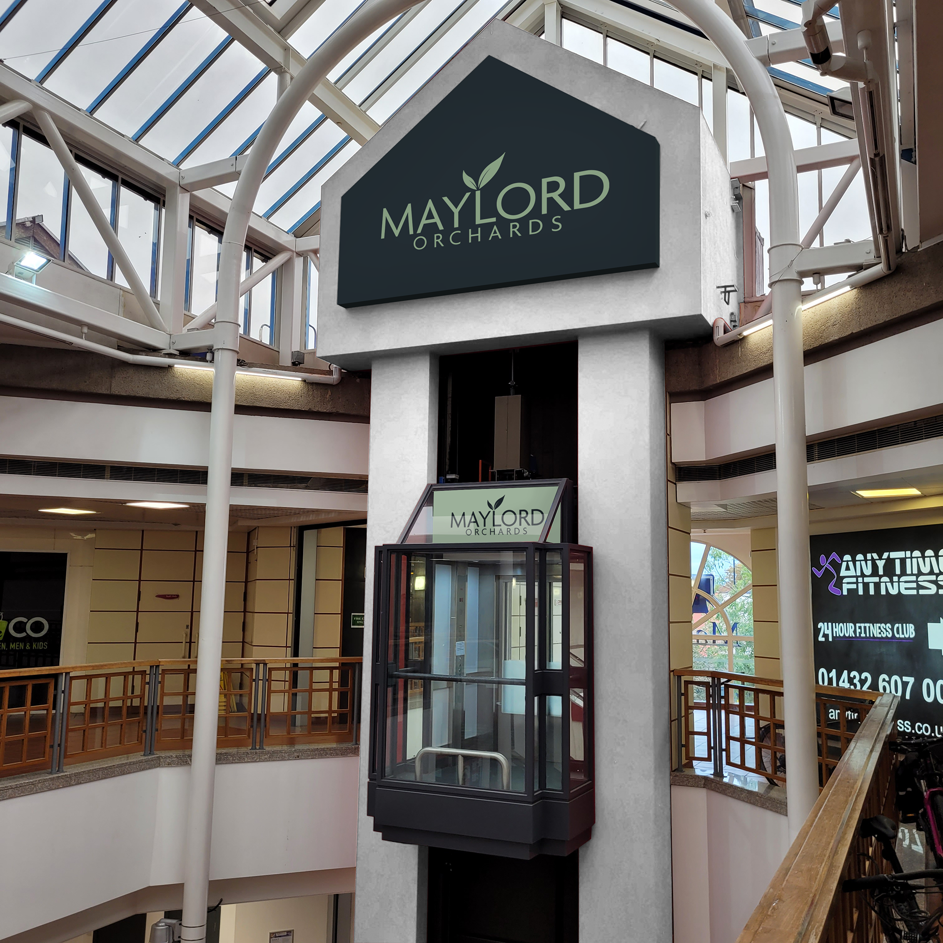
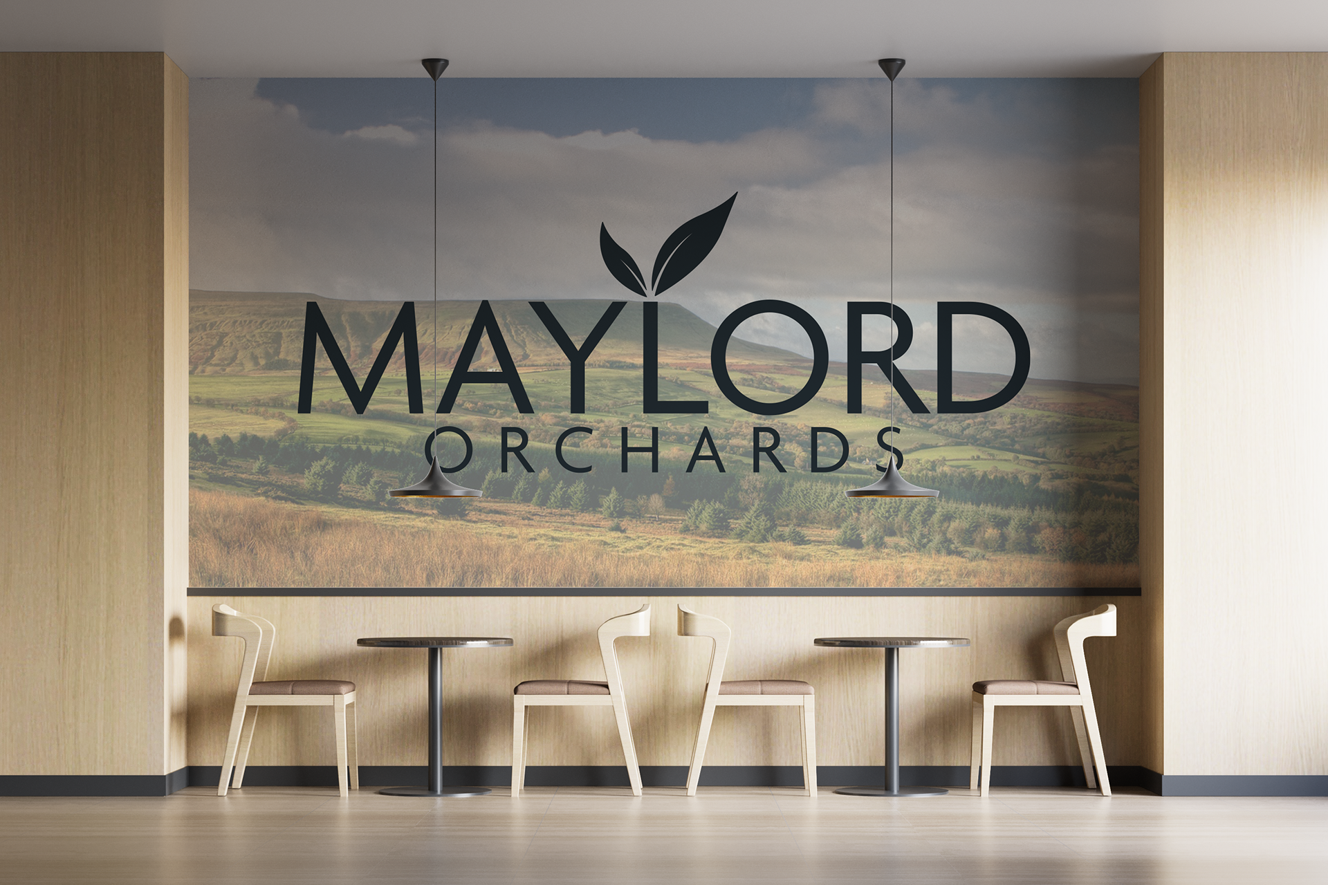
The council (who ownMaylord Orchards) came to us looking for a rebrand for their refurbished shopping centre. This Center was to additionally hold the library and comfortable space for the public to sit and work. The idea presented to us by the architects was to bring nature indoors with plants, trees, grasses and wood panels over the existing elements of the building to allow them to blend in.
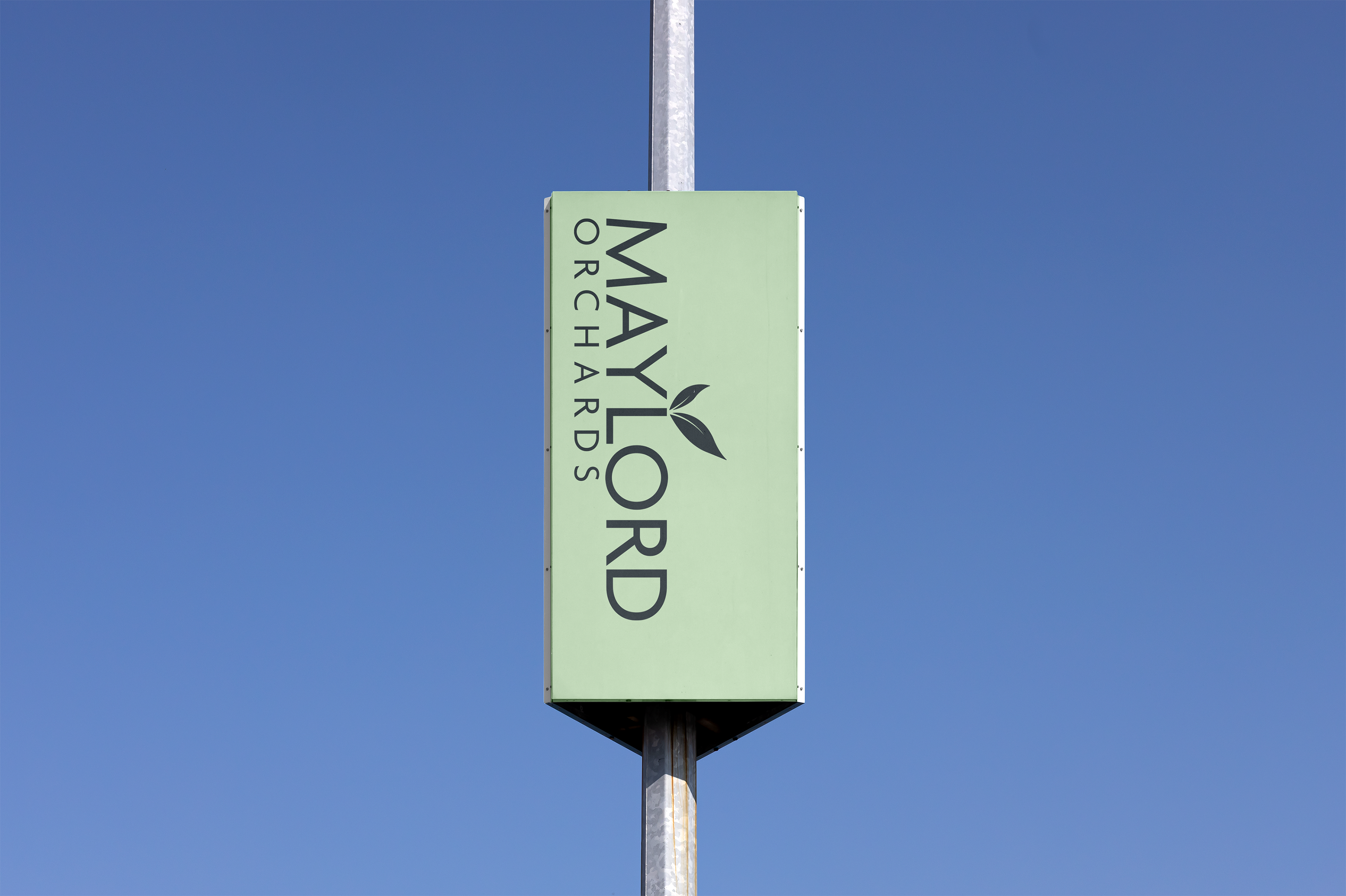
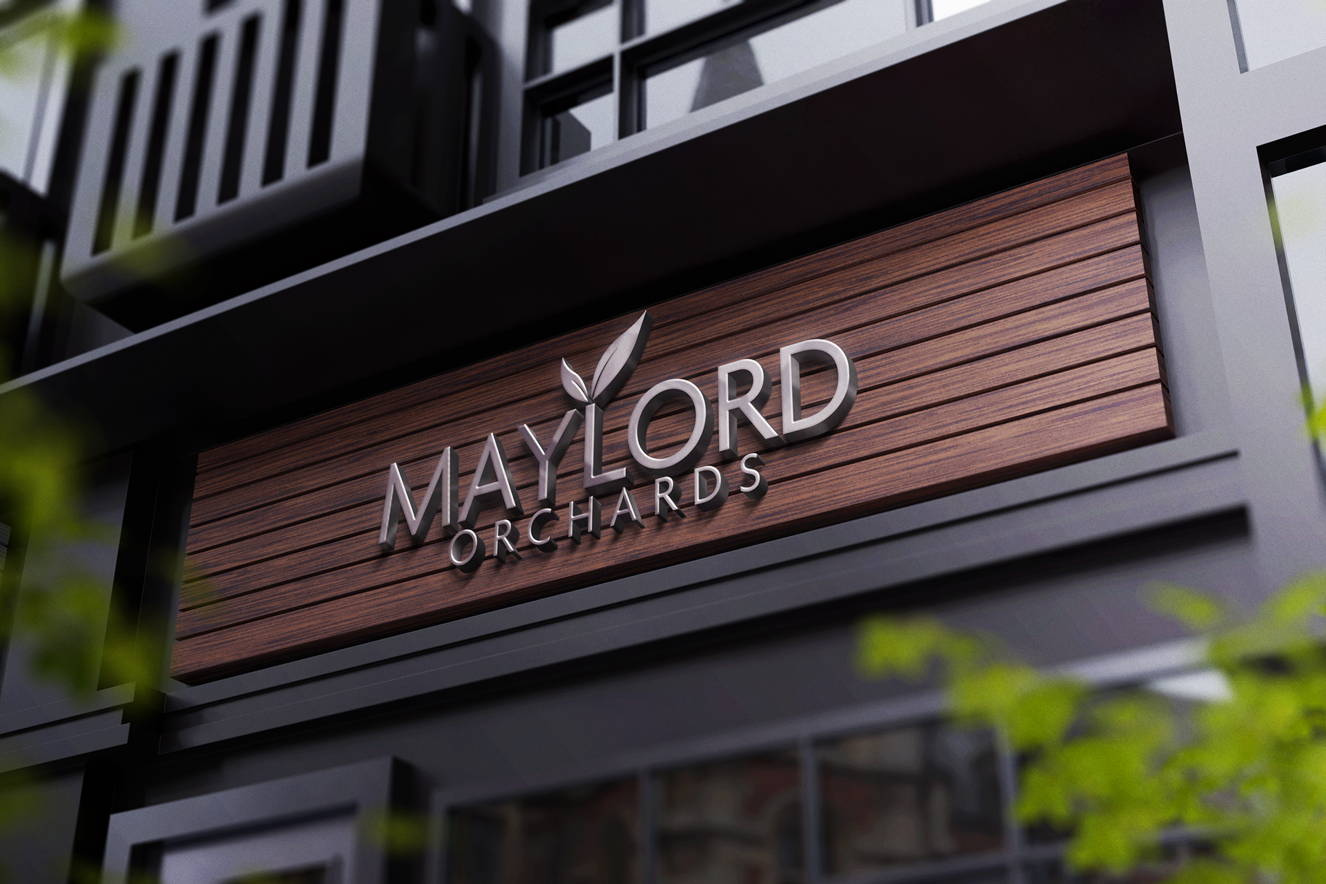
My outcome brought the elements of nature through the use of leaves into the logo to link it with the architect's vision. The council needed something that would stand the test of time which is why The design I have produced is minimal and bold. The typeface chosen is angular representing the structure of the building.
I chose to make the word Maylords so bold because everyone in Hereford knows the name of the centre. This allows familiarity to the public even if the council brings the word orchards back into the name.